

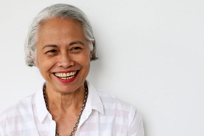
Lucille Tenazas, designer
This week we’re in New York checking out the book shelves of graphic designer and educator Lucille Tenazas. Originally from the Philippines, she studied at the Cranbrook Academy of Art at the height of its 80’s influence, and has worked and taught in the States since graduating. She continues to run her own studio, focusing on typography and linguistics, while teaching at the Parsons School of Design as Associate Dean in the School of Art, Media and Technology.
As ever, we asked Lucille to select three publications: an old, a new one, and one other project of interest.

An old issue: Normal, Winter 1987, Exotics and Exiles
Normal was billed as a ‘Quarterly of Arts and Ideas’ published by Rizzoli International Publications in the late 80’s. It had a sporadic schedule (only four issues in three and a half years) and refused to carry advertising, with each issue intended to be underwritten by one or more sponsors.
Its editor and publisher was Gini Alhadeff, who approached the famous New York designer and illustrator Paul Davis to design a new culture magazine. Davis’ most significant contribution to American graphic design is his theater posters for the New York Shakespeare Festival done during the mid-70s which challenged the conventions of contemporary theater advertising. Designing Normal was his first foray into magazine design and lacking a strict format, devised an experimental strategy where each story was independently designed with its own typographic approach, right down to the page numbers.
In the 80’s, I was a young designer in New York after having studied at Cranbrook Academy of Art in Michigan, where the prevailing design ethos was Swiss-influenced, combined with the radicalism of California New Wave. I thrived in the dynamism of this visual complexity but increasingly realized that I needed a different source of inspiration and insight beyond what design and trade magazines offered. It was then that I discovered literary references, and combined with my interest in linguistics and typography, gravitated towards material that was simultaneously rich in content and visually provocative.
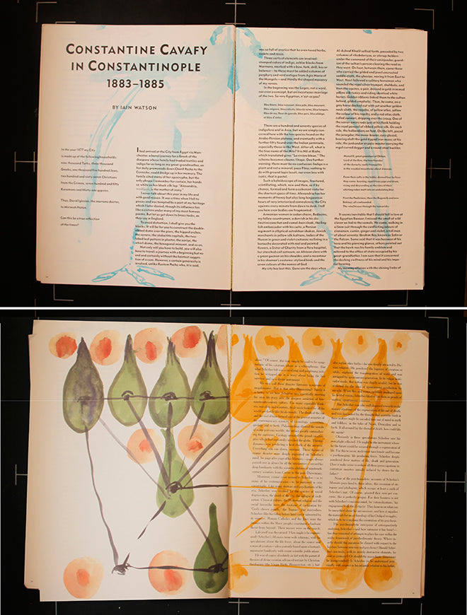
My issue of Normal is of a large format, 9.5” x 13” and printed on cream uncoated paper. The Contents page featured essays and interviews on writers as diverse as the French novelist, Marguerite Yourcenar and the Greek poet, Constantine Cavafy. Surprisingly, the issue also contained an excerpt from James Hamilton-Paterson’s memoir, Playing with Water, where he recounts his experiences of spending part of every year living on an uninhabited island in the Philippines, my native country.
When I initially thumbed through the pages, I noticed that every single page had drawings and watercolors on it. The text seemed to float above the visuals and I tried to make sense of the connection the images had with the narrative. In the editor’s note, it said that all the drawings and watercolors done by Ray Smith between August and September 1987 in the state of Jalisco, Mexico…. “were separately selected, put in sequence and numbered: no conscious attempt was made to connect text and image. The final combination of the two, as reproduced… was therefore accidental.”
The result was lyrical and spontaneous… I reread the stories and essays again and again, reveling in the visual richness of the pages. I hesitated to call the drawings interventions—instead their mere placement and random overlaps on the text created a visceral, textural presence that I continually look back to with pleasure and awe, almost 30 years later.

A new issue: Flaneur, #4, Rome, Corso Vittorio Emanuele II
I was introduced to Flaneur at a publications pop-up kiosk at TypoBerlin last year and was immediately drawn to the title which was the name of a street in Rome, Corso Vittorio Emanuele II, more commonly referred to as Corso Vittorio. Flaneur focuses on the life of one street within a city per issue. The magazine focuses on the street’s complexity, its rich layers of architecture and the life of its varied inhabitants through a literary approach. A meaningful thread ties together locations, experiences, stories and objects that revolve around the street.
Corso Vittorio Emanuele II is the wide east-west thoroughfare that cuts through the center of Rome which Italians consider largely responsible for destroying the essence of the city. It is ironic that it is linear streets like the Corso that confuses the Romans, who are used to navigating labyrinthian and chaotic streets but whose sense of orientation is informed by paying close attention to churches, a fountain, or storefronts like a glove store or alimentari (grocery store).

From 2005 to 2006, my family and I lived in Rome when my husband, artist and photographer, Richard Barnes was awarded an arts fellowship at the American Academy. We walked the length of Corso Vittorio numerous times and traversed it like many Roman citizens and tourists on our way to see famous sights like Piazza Navona, the Pantheon and Campo di Fiori. As a contemporary designer living in Rome, my faculties of observation were heightened by the tangible vitality of the city’s stratification. The unrelenting layers of history are very tangible-- with space and time folded into each other in a continuously evolving palimpsest.
Within Flaneur’s pages, Corso Vittorio came alive through the voices of writers, poets, artists, photographers and filmmakers. Like its namesake street, the magazine reflected a polyphonic surface of overlapping text, eclectic typefaces, random images, and various paper stocks. This treatment perfectly manifested the physicality of navigating one of Rome’s busiest, if undistinguished thoroughfares.
As the magazine’s editor states, “The magazine is aware of its subjectivity. It wants to say “This could be Corso Vittorio Emanuele II (itals, mine)”

And another thing: Lapham’s Quarterly, Volume VII, Number 4 Fall 2014, ‘Time’
Lapham’s Quarterly is a literary magazine established in 2007 by Lewis H. Lapham, formerly the editor of Harper’s Magazine. Each issue focuses on a single topic of interest or concern—war, religion, money, medicine, nature, crime-- using primary source material from history. Each issue begins with an introductory essay by Lapham, followed by readings from historical contributors, and essays by contemporary writers and historians. Texts are drawn from authors like Aristotle, William Shakespeare, Leo Tolstoy, Mark Twain, Thucydides, Virginia Woolf, Charles Dickens, Edith Wharton, Edward Gibbon, Mahatma Gandhi, Confucius, Jane Austen, Jorge Luis Borges, Henry David Thoreau, and Joan Didion.

The format and layout of the magazine is elegant and spare, a calm backdrop with which to appreciate passages from the world’s great literature and reproductions of artwork by the world’s great artists. It is in reading excerpts from letters, speeches, diaries and songs that we see the artful and thoughtful relationship between the then and now.