

Safar Journal #4
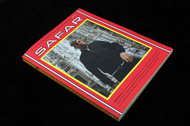
The words emblazoned across the top of the cover of the latest issue of Beirut’s Safar Journal clearly set out the magazine’s aims. ‘Flirt with, flee from, and fall for graphic design and visual culture’ they promise, a perfect description of the magazine’s bringing together of Arabic and western design languages. It relishes the challenge and is full of treasures, so we’ve picked it as our Magazine of the Week.

As a western reader it’s fascinating to see Lebanese culture mix with international influences. The pairing is emphasised by the two covers – the main one in English, a second version on the back in Arabic. The text pages are printed in a vivid combination of red and yellow, the use of two languages across the pages simplified by their use of Latin and Arabic alphabets.

The issue theme Nostalgia digs up plenty of wonderful visual material. A collection of Lebanese film posters showcases what to new eyes are beautiful, illustrated advertisements (above); the accompanying text explains how what was once considered commercial kitsch have been reconsidered with the benefit of a nostalgia for times gone. Writer Zeina Maasri highlights the cultural encounter between global and local, and recognises the intricacies of the rich history of the posters, which ‘thickens their contemporary ‘vintage’ skin.’

The magazine is characterised by long, in depth pieces, fleshed out with abundant full-page photography. One such piece is ‘There won’t be Blood’, by Mustafa Jundi (above). It’s a visual history of the symbolism of the Cedar Tree – the national symbol in Lebanon’s flag. The depth of research into its establishment, and representations in intricate official wax seals enriches its mythology. Yet, because of major environmental crises, the trees themselves are endangered. The piece highlights the symbiotic relationship between a man-made visual and natural ecology.


Another rich source of visuals is a history of Arabic book design (above). This is where the bilingual nature of the magazine really comes to the fore, as the Arabic script that comprises at least half of the magazine is, now, the primary language at play in both the design and the writing.

Other pieces show how global culture has affected Beirut, too. An interview of RuPaul by Paul Holdengräber interview is unusual in that the original full-page colour photos have been plastered over with black and white shots (above). Safar’s editors told me: ‘Dressing in drag and performing in drag shows is a dangerous, sensitive activity in Lebanon. Not all of the featured drag queens are out to their families, and so they feared being outed.
‘After the issue went to print, one of the drag queens recognised herself in the photos, and she came forward saying that the photographer had not received her consent to publish it. In conjunction with the drag queens, Safar decided to transform the photos that accompanied the article into a statement about consent.’ It brings a layer of intrigue and costumery to piece which only enhances its subject matter.
Safar’s strength for us is where the magazine gives us, as Londoners, exposure to Arabic culture that we otherwise don’t see represented in magazines – and especially visually in this rich, dynamic way.
Editors-in-chief & Creative directors: Maya Moumne and Hatem Imam
Designers: Siwar Kraytem, Lynne Zakhour, Ayla Kekhia