

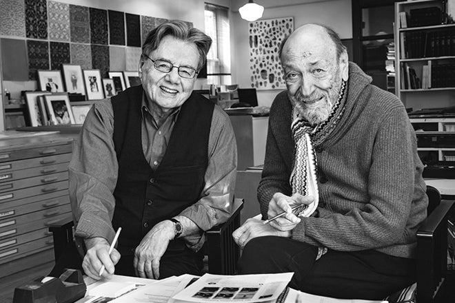
Walter Bernard & Milton Glaser
Earlier this year I visited Walter Bernard and Milton Glaser in New York to look over the working pages of a new book about their magazine work. ‘Mag Men’ tells how Glaser hired Bernard in the early days of New York magazine, and charts their subsequent work both individually and together as WBMG, designing over 50 magazines across the world including Time, Fortune, The Nation and Paris Match.

The studio we met at has been home to the two men and their teams since the seventies; a shrine to graphic design, the four-storey Murray Hill townhouse is where Push-Pin Studios was based during its heyday and where New York magazine was launched in 1968 and Ms magazine in 1971.
Looking through the pages of ‘Mag Men’, it was immediately clear it was a key addition to the range of books about magazine design and production.
Published this week, it provides a fascinating portrait of the sixties, seventies and eighties, a time of drawing boards, cow gum and brave new launches. It also offers plenty of general insight into how magazines are produced, with commentary as relevant and useful today as ever.
As the book appears, Bernard and Glaser are adjusting to the end of their long-standing shared base. Glaser’s team have just moved to SVA, while Bernard’s are moving to a new studio in a few months.
They talk here about the book, their shared history, and their immediate plans.

Tell us about your typical Monday morning.
MILTON GLASER: My team and I are now in a new studio, having sold 207 E32nd Street building (above) to the New York Review of Books, a wonderful publication, that intends to continue the literary landmark history of the building, particularly in regards to its past as Tammany Hall Courthouse, and afterwards the home of Push-Pin Studios, New York magazine, and ultimately, the launching pad for MS magazine. The baroque Italianate architecture qualities will be retained and restored, for which I am happy.
Our new office is in the School of Visual Arts, on 21st Street, in the midst of a lively student enclave with tremendous vitality.
The team is truly diverse, consisting of Ignacio Serrano, a Spanish artist and designer, recipient of a Fulbright grant, who studied and worked in Germany for some time, XiaoHua, an elegant Chinese artist and illustrator, Din, a Palestinian recent graduate of the Cooper Union in architecture, Ke Zhang, also Chinese who arrived after finishing her design education in Vermont, and Anne Quito, a Filipino journalist who was responsible for editing Mag Men.
We have a truly international lively group that likes to be together.

The E32 Street block where Glaser and Bernard have been based was honoured with the name Ms Magazine Way in 2017.

WALTER BERNARD: I have lived only one block from our office since I worked at New York magazine in 1968. So my commute to E32nd Street is a short, easy walk. These days my staff arrives at 10am but I am in between 9am and 9:30. I will have a coffee, read a newspaper and answer emails.
Sadly, Milton and I will no longer see each other every day, but we will talk and meet frequently. We may occasionally collaborate on a project, and we will always remain friends.
Which magazine do you first remember?
MG: My early influences were mostly from the field of comics strips, rather than from magazines, although an early job I got after the Cooper Union was with Condé Nast during its golden era.
I learned there that people in the magazine business always thought they had a special privilege in relation to others.
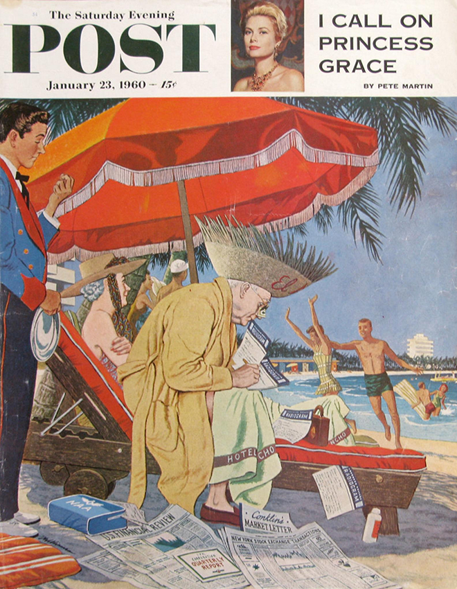
WB: The Saturday Evening Post, Boy’s Life, Colliers and Life magazine.

The current edition of New York magazine is it’s annual ‘Reasons to Love New York’ issue.
Which magazine matters to you the most right now?
MG: The magazines I still feel related to are New York magazine and The New Yorker, which both have editorial content that still relates to my life.
WB: New York, The New Yorker, Smithsonian. I still look at Time magazine.
Early covers reflected the magazine’s origins as a supplement to the Herald Tribune newspaper, featuring general reportage imagery of the city.
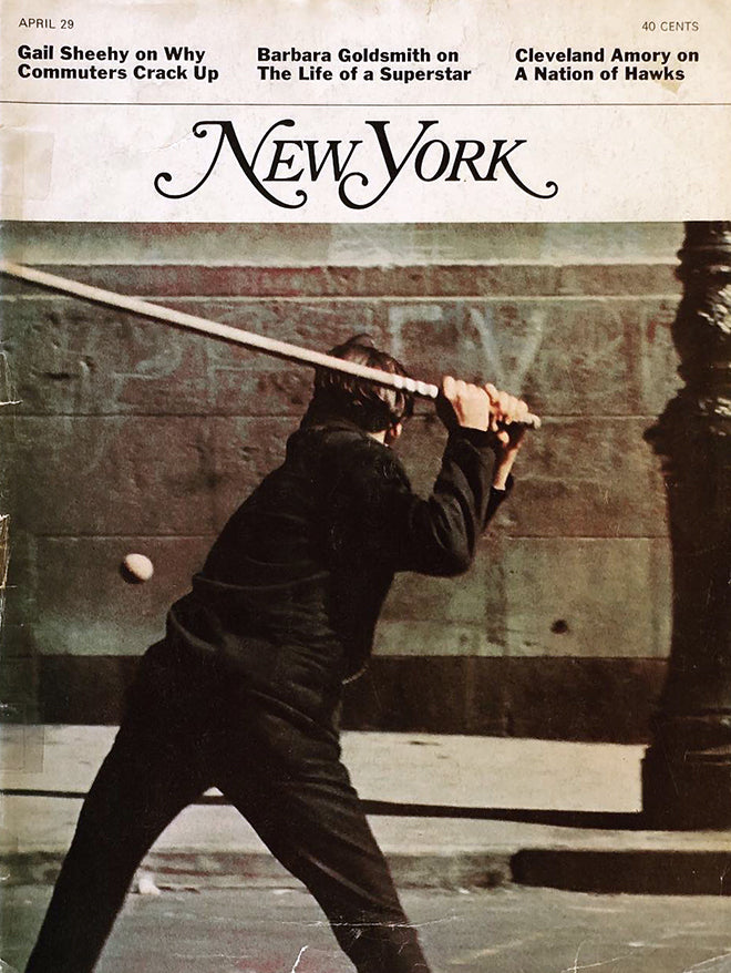
MagMen opens with a detailed look at the launch of New York magazine. Did you realise how influential the design of those early issues would be?
MG: We made many mistakes in the original launching of New York, mostly in the process of attracting a new audience for a product that didn’t quite exist yet. It took us some time, but we finally found a new voice based on our own interest and the principle of being on the reader side.

The magazine has continued in that spirit, and serves its audience with material and fields unavailable elsewhere.

WB: I was hired by Milton in June of 1968, three months after the launch. We were struggling to find our voice and rhythm early on. We began to design weekly covers related to the content of the magazine, discarding the old New York newspaper supplement model. We settled on a new headline typeface (Egyptian bold condensed) from the few available at our typesetter. We didn’t think about influence, just survival.
New York magazine today is the best version of itself. Under editor Adam Moss, the magazine gained new energy, adapted to the online culture, and retained the spirit of Clay Felker’s and Milton’s original.
What do you hope the reader takes away from the book?
WB & MG: The book chronicles our experience working with the many talented people whose collaboration make magazines happen: over 75 artists, writers, photographers and editors who worked with us over the years. The work shown in this volume includes selections from our nine years at New York magazine, five years working separately and 20 years working together as ‘magazine doctors’ at WBMG.

We have tried to include successes and failures, hits and misses. Along with an emphasis on graphics we recount stories and observations of our many colleagues who contributed to all of the material in this book. Magazines are not created in a vacuum. External forces affect editors, writers and readers in their daily lives.

On its most fundamental level, a magazine is a collection of energy and information. We hope the reader will take away an appreciation for the complexity, invention and joy it takes to produce a good one.

What stands out throughout is the sense of storytelling to all the work. The 1969 John Lindsay ‘Too Tall’ cover of New York is a great example. Can you remember how that cover came about?
MG: At the time we had no cover idea except for some indifferent portraits of John Lindsay. I sent a photographer to take a photo of a model in Central Park and simply trimmed his head off on the cover. The nice thing about the magazine is that our response could be immediate and unbureaucratic, and depended more upon ideas than the details of execution.
WB: It was a simple idea of Milton’s. We at first tried to cast a John Lindsay look-alike but it wasn’t quite right. Cropping off his head made it work better than expected.

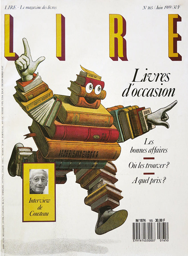
The WBMG studio in the eighties, the designers at their drawing boards, with Glaser and Bernard standing, centre. Note the enlarged LIRE cover at the end of the corridor.
The book also reveals the hands-on craftsmanship of seventies magazine design. How do you feel about how that process has changed?
MG: There is no comparison between the primitive nature of our operation in our original magazine. Retrospectively, I can’t imagine how we were able to produce it every week.
I don’t think anyone now would be able to produce some magazine in the same way on a weekly basis. Computers have made the process infinitely simpler but not necessarily improved the quality of either narration or visualisation.

A spread from a 1988 edition of the Journal of the Society of Newspaper Design reveals the layout of the WBMG studio, with WB and MG shown sat together, and noting Bernard’s hobbies, music choices and the contents of his wallet.
WB: That hands-on craftsmanship took long hours of handwork. Now staffs are reduced, typesetting companies no longer exist, and everthing in pre-production is done in-house by a smaller group. Many options of page design are readily available and reproduction has improved. Those are good things. But the strength of a design idea remains the same.

How did you find the shift to working with non-English publications? Did that jeopardise you’re storytelling abilities?
MG: In magazines the issue is very often clarity and predictability, as opposed to novelty and surprise. These elements might not be evident in the storyline alone but came out of the arrangements of typography, form and colour.
WB: Working in Paris for the first time with LIRE magazine we brought along a French colleague who understood magazines and was fluent in English and French. However most non-English publications had many bi-lingual journalists. Our role was to understand their point of view and to help them tell their stories through an updated design.
Magazines have their own references that go beyond language and nationality.
If storytelling was the only issue, it would be impossible to serve the needs of publishers operating in other languages.
The book highlights 50 years of editorial work; what is the one piece of advice you would draw from this to help the contemporary magazine art director?
MG: Keep an open mind, remember that magazines are collaborative endeavours.
WB: Read magazines, books, newspapers, listen to podcasts. Stay informed and be open-minded.
What’s going to be the highlight of the week for you?
MG: I have no idea what the highlight of this week will be. Usually is not what I expect.
WB: It’s always an unexpected surprise. This week it’s a beautiful reproduction for a New Year’s card featuring my granddaughters.
Our next projects include: page design and book jacket for a new novel; a identity for a local TV company; design and production of a new issue of Scandinavian Review.
‘Mag Men’ is published by Columbia University Press, ISBN 9780231191807
Read an excerpt from ‘Mag Men’.
walterbernarddesign.com
miltonglaser.com
Lead portrait and contemporary studio photography by Leo Sorel