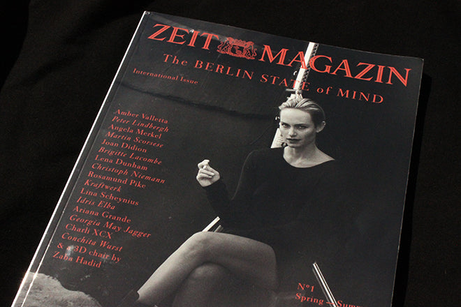
Zeit Magazin International Edition
The weekly newspaper supplement Zeit Magazin gets plenty of coverage online for its cover designs. The double front covers came about almost by accident during a redesign – read the first one, turn over for the second frame of a brief story or joke. But outside Germany it can be hard to appreciate the weekly content beyond admiration of the visuals and the fine contributors list.
Until now: for the last year their biannual International Edition has offered an English-language overview of the weekly. ‘We realized that many of the stories we publish in the weekly could be interesting for an international audience, so we came up with the idea of launching an international edition in English,’ explains editor-in-chief Christoph Amend. As the two most recent editions arrived by post just before I headed on holiday, I took then with me and have thoroughly enjoyed their sharp, intelligent mix of content and presenatation.
While the weekly runs at between 50 and 120 pages depending on the season and ads, the biannual weighs in at 258 pages, so it is a highly edited selection of the weekly. ‘It started as a Best-Of of the weekly, but we have been adding exclusive columns for the international issue and will continue to do so. Zeit’s deputy editor and editor of the politics section, Bernd Ulrich, writes about “The Merkel State Of Mind” in every issue, analysing the strategies of Germany’s Chancellor,’ adds Amend. This opens the publication furtherfor a foreign readership, justifying the cover offer of ‘The Berlin State of Mind’.
Here’s a selection from the recent Spring-Summer 2015 edition.
 ‘Our City of Love’ is a photo report by Vincent van de Wijngaard telling the story of 11 couples that met in Berlin. The design of the captions, biographies and clothes credits (below) is typical of the magazine; simple but distinctive.

Alongside such visually-led features there are the more text-orinetated, such as as interview with the editor of the New York Review of Books (below).


Still lives are a regular feature; this one, shot by Berlin-based Haw-Lin Services (above) demonstrates the magazine’s finger-on-the-pulse photo direction. The story is about the new consumer-curator.

Last year the weekly Zeit Magazin featured an overview of the graphics from the recent Kraftwerk tour (above). Now we non-Germans can enjoy the whole story, designed for 3D glasses (not included).

Regulars include illustrator Christoph Niemann, whose breakdown of simple dot-screen patterns to represent food and drinks (above) is typically spot-on; a weekly infographic map of Germany is collected together to for a series on subjects ranging from types of trash can (below) to types of beer via unique local museums.
 Each international edition ends with a look back at archive covers, in this case picking out changing fashions and fashion photography (below) including their 40-cover edition to mark Claudia Schiffer’s birthday.
 The International Edition is a really worthwhile extension of the weekly, giving non-German speakers access to the work of one of today’s great editorial teams. Definitely a magazine to watch as it develops each issue.
Creative director: Mirko Borsche
Art director: Jasmin Muller-Soy
Photo director: Milena Carstens


