Billy Sorrentino, Wired

An exciting recent development in US publishing has been Condé Nast’s investment in Wired magazine. The appointment of Scott Dadich as editor-in-chief and the subsequent building of a new creative team has seen a reinvigorated print edition and a huge investment in digital. Following the recent relaunch of wired.com, we look ahead at the week with Billy Sorrentino, head of creative, executive creative director across the whole Wired project. Sorrentino was previously design director at Condé Nast’s Editorial Development Group, where he worked closely with Dadich on the development of the company’s digital editions.

Where are you today?
I'm here at the Wired offices in San Francisco, California.

What can you see from the window?
My office directly faces the art department, so I’m lucky enough to see my photo team, design team, video team and web team. On the other side of the art department we have a large beautiful print of the interior of the NASA control center, shot by our staff photographer Dan Winters.

Are you a morning or evening person?
Both? I'd say more of a morning person, but we love our late nights here too at Wired.


What was the first magazine you remember enjoying?
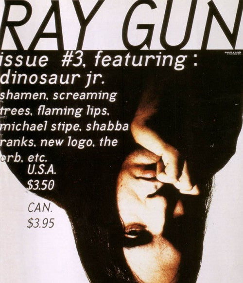
Raygun, Thrasher, Big Brother and Maximum Rock ’n’ Roll. I grew up in a beach town in Virginia where skateboarding and punk rock were staples.


What’s your favourite magazine this morning… and website?
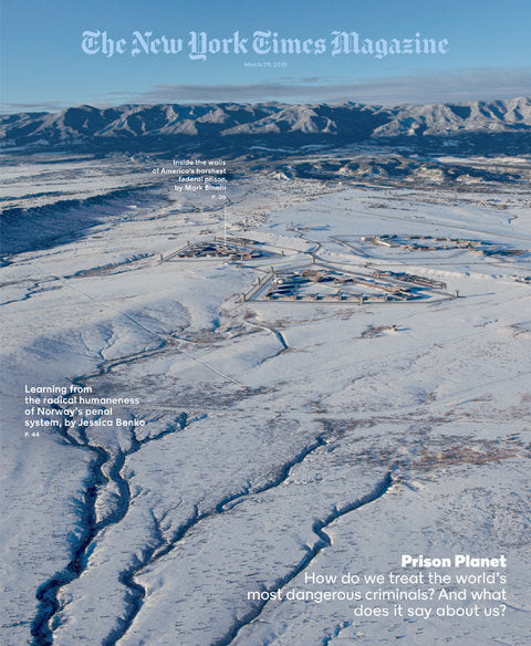
I'm not a big soccer fan, but I think Eight by Eight is gorgeous. I also look forward to seeing what Gail Bichler and her killer team are up to every week with New York Times Magazine. On that note, the Times do a consistently beautiful job with their long form storytelling and data vis features online. My favorite site though is kind of a cheap answer: Pinterest. Our design team uses this constantly for inspiration, private mood boards, photo or illo direction, and lastly finding great shots of Waylon and Willie.

The recent wired.com redesign attracted a lot of attention for the design, but it was much more than a visual reinvention. Describe the scale and complexity of the project.
We spent the better part of two years on the design. It was Scott Dadich's first priority when he took over as Wired’s editor-in-chief. In fact, I was still design director at Condé Nast’s Editorial Development Group when we started putting pixels to the page. The real challenge wasn't our design vision or voice, but redesigning our tech under the hood.
Initially we had 17 different Wordpress instances that over many months our tech team narrowed down to one. After that lift we could really start exploring flexible grids, our type theory, and our design philosophy for the site. We look at this recent launch as just the very beginning, we have very ambitious plans for this upcoming year!


You’re responsible for the print, tablet and digital iterations of Wired; is that the same for all creative staff, or are most dedicated to one part?
When I first started at Wired, our web team and video team worked across the floor from the photo and print design team. We immediately combined the team to be one single art department. We all sit together, and ultimately share responsibility for the visual executions across the entire brand. I have amazing leads for each department to ensure we're upholding Wired’s visual legacy.
David Moretti is my deputy and brings unbelievable creativity across all tiers. Dylan Boelte leads our digital efforts, and as much of a UX guru as an art director. Anna Alexander and Patrick Witty can be producing shoots with tech luminaries in the valley for the magazine, while shooting illegal sand mining in India for a wired.com piece. Ultimately, the art department is composed of people who love visual story telling. It’s my job to ensure each designer or photo editor have the flexibility and vision to see it across all mediums.
 Looking ahead, can you and the senior team at Wired see a time when the print edition fades in importance as the possibilities for a better, more magazine-like design experience grow online?
First, more magazine-like design experiences are already popping up across the web, and that's incredibly exciting. Like-wise, elements from the web are appearing in print, enriching that experience as well. I’m a big believer that quality, beautiful print publications aren't going anywhere. But I think as designers we need to reject the notion of print versus digital. A magazine is a curated collection of stories, not a few forms of 8x10 paper glued together. A well-designed collection of stories online is as much as magazine as the one in your mailbox every month. I think we owe it to our readers to tell the best stories we can, as beautifully as we can, agnostic of medium.

What are you most looking forward to this week?
Our May issue just shipped, and I’m headed to NYC to play a gig with my band Brothers NYC. Really excited to see my New York friends. In a few weeks I’m heading to London for D&AD, which I hope includes grabbing a pint with you, Jeremy!
What are you least looking forward to this week?
The NYC weather. California’s been spoiling me...
What will you be doing after this chat?
We have our morning design meeting in 10 minutes. I'll try my best to sneak in a coffee run.
wired.com
At work with David Moretti.
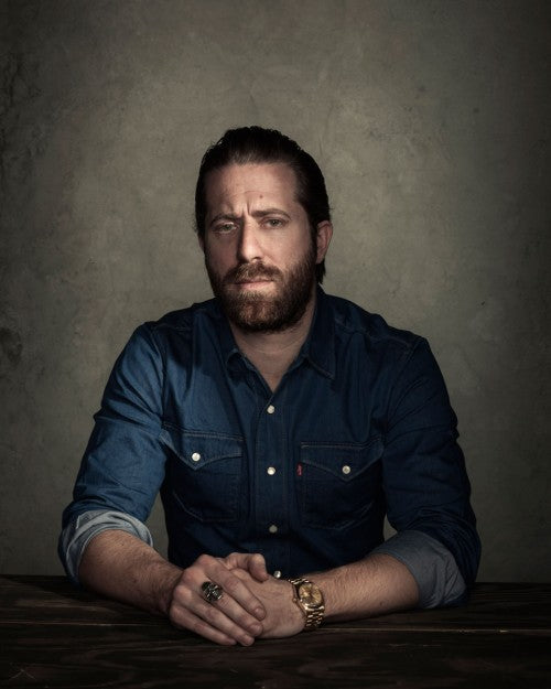
Portrait of Billy by Dan Winters


