Disegno #10
London-based design magazine Disegno has just released its redesigned tenth issue and announced that it’s upping its run to quarterly. After so many years of producing biannually, the news is a welcome surprise, especially because when Tyler Brule asked editor Johanna Agerman Ross on The Stack if they would ever go quarterly, Joanna confidently stated that they wouldn’t.
But now that the magazine has been growing so strong – its editorial team has expanded and it has a distinct voice that stands out from other independents that focus on similar subject matters – the quarterly pace feels like the logical next step. As Johanna says: “We only decided on going quarterly once we saw that there was an interest from readers and advertisers. This was a natural evolution ” The elegantly executed change and development of Disegno is why we’re celebrating the publication as our Magazine of the Week today.
To reflect the change, the new Disegno also includes more news stories and time sensitive material (below). As Johanna explains, the news in the magazine is still more reflective than the reporting they do on their website though: “The online platform still remains and will report news as and when it happens through our newsfeed. However, reflecting on news is perfect for the printed page as it needs some more time to digest and settle. By reflecting on news we mean putting it in context and seeing its value, by being quarterly we have more opportunity to do so as the things we write about will not feel too far away.”
As asserted in issue 10’s editor’s letter, “a new approach to publishing requires a new approach to form”. That’s why the team brought in Florian Böhm and Annahita Kamali of Studio AKFB to redesign the magazine and to take on the role of future Creative Directors. “The fact that Florian is also a brilliant photographer was a bonus of course and Annahita's background in fashion was great when approaching our content, which spans design, architecture and fashion,” says Johanna.
“Studio AKFB also showed a great understanding of and insight into what we needed to achieve and I felt we were very much on the same page,” she continues. “The fact that we managed this redesign being based in two different cities and only meeting twice is testament to that. It is also interesting to work with designers that know the design industry very well and yet they had never designed a magazine, so it was an exciting challenge for them and for us.”
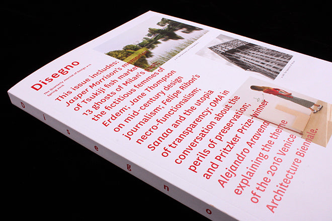
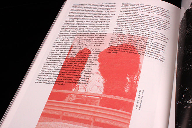
A magazine - more often than not – is for reading as well as looking, and this is especially true of text heavy Disegno. That’s why Florian and Annahita focused first and foremost on creating a pleasurable reading experience, and they did this through concentrating on type, leading, and weights. As a result, text is often favoured over image as it cascades over photographs that have been subdued by a neutralising wash (above). The red type on the text-heavy cover reaches out over the images too (below) – from the moment you pick Disegno up, the magazine is asserting its new hierarchy and emphasis on the written word.
On the Disengo website, there’s an interview with Florian and Annahita that goes into detail about their selection of fonts (Tiempos and National).
The spacious way that dense blocks of text have been organized also gives the magazine a lot of space to breathe (above) – and it makes for a reading experience that’s never claustrophobic. The most impressive thing about the new design is how it packs in so many words but without feeling overcrowded or repetitive.
Despite all the effort that has gone into making a magazine for reading, the Disegno team would rather you didn’t notice it at all. That’s because they want reading the magazine to be more akin to breathing, something you take for granted – and the way that the type curves against the white page and the rhythmic pacing that results because of length of each column does mean that you don’t think much about the magazine at all but get swept into the ideas instead.
There are a lot of magazines that revel in white space and clean, spacious design at the moment, but with these publications, minimalism is often an aesthetic choice. What I like about the new Disegno is that its layout is a functional choice. So after you’ve quickly noticed how breezy the design feels, you can get stuck into Jasper Morrison’s story about a Tsukiji fish market, Jane Thompson’s essay on mid-century design journalism, an exploration of plants in design history and a guide to Milan’s aesthetic history.


