Editorial Magazine #14
Every so often I come across a magazine where I think, hang on a second, why isn’t everybody reading this, and why hasn’t this become a contemporary indie mag favourite yet? That’s how I immediately felt about Editorial Magazine, which Jeremy stumbled across recently when he was in New York. It’s probably the case that Editorial Magazine is popular overseas and in its hometown of Montreal, and that it just hasn’t gotten over to Europe yet. I’m certain that now it’s here, it’ll be lining European magazine shelves and neatly slotting in-between The Gourmand, Riposte and Mushpit in no time.
Editorial is the art and fashion magazine I’ve always dreamt of — a mix of the edge and energy of Mushpit, the smart voice and critical take to art that you come across in Bomb Magazine, and the strange, fantastical approach to fashion that you find in Buffalo Zine. 032c and Sleek also tackle art and fashion, but Editorial navigate their theme without the intense interest in wealth and business that can be important to the Berlin-based magazines.

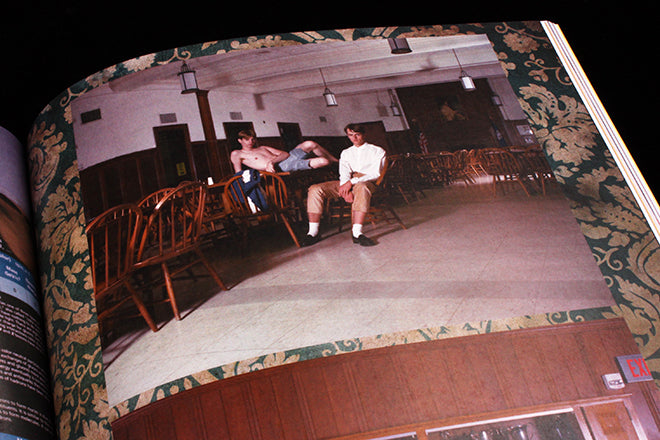
 The art Editorial covers is mostly contemporary, colourful figurative painting, but they also refreshingly add illustration into the mix. There’s an interview with the artists Maren Karlson (above) and Rookie contributor Minna Gilligan, but then in the centrefold there’s also a risograph poster drawn by Clay Hickson and printed at his Tan & Loose Press (also above). Editorial’s fashion is like its art: it’s cool, laid-back and playful, like their Jody Rogac shoot styled by Leila Bani (below).


 Features and essays are smart and on-point; I particularly enjoyed an article by Brad Phillips entitled ‘Sympathy for the Forger’, which considers the way that contemporary art and illustration is blatantly borrowing from the work of modernists like Matisse and Klee (above). It’s refreshing to see a magazine that critiques it’s own aesthetic—a spread of work by Grace Miceli (above) is contextualised by Phillips’ essay although it isn’t directly referenced in it, and her drawing is made all the stronger because of the criticism and thought that surrounds it.
 A magazine shouldn’t always just showcase, it should also reflect and consider, and Editorial realises this and relishes in it. There’s a lot of list-like magazines at the moment: extensive, printed pamphlets full of artists and photographers that the editors admire, and although there is a place for showcasing, a lot of magazines are losing sight of their critical capacity. An interview with Martin Gregory about his blog, Things I find in the Garbage, and a spread of artwork by Jamian Juliano Villani (above) are also provocatively contextualised by Editorial.


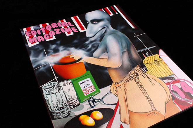
 Victorian typefaces and decorative borders (above) create a colourful and unusual pastiche that I’ve only ever come across before in the last issue of Buffalo Zine. In 2015 there’s been an on-going discussion about the clichés developing in independent magazine design, and Editorial—along with the restless, ever-changing Buffalo—is a perfect example of a publication doing things differently. Bright yellow pages, columns of text squeezed to the page edges and that surreal, fantastically uneasy cover makes Editorial immediately stand out from some of the more tidy, minimal mags that have become the status quo.
Editor-in-chief and designer: Claire Milbrath


