


Eye on Design #1
The US-based site Eye on Design has been steadily building a reputation for its coverage of graphics over the past three years. Funded by non-profit AIGA, it has an open remit to cover graphic design in all its guises and does so with a sharp, ahem, eye.
Alongside traditional online fare — a visit to a designer at her studio, lists of favourite posters — it runs detailed critical pieces that reach higher and dig deeper than most online graphics coverage. A strong team of editors and writers include names recognisable from writing for London-based sites like It’s Nice That and, indeed, magCulture. The transatlantic nature of the contributions give Eye on Design a unique editorial sense, which is backed up by a strong visual identity (try leaving a page open and unattended for a few minutes).
The site has always paid attention to magazines, which makes the decision to launch their own print publication less of a surprise.
The magazine version of Eye on Design comes in a neat handbook-sized format with a series of diecuts on the cover and first two pages that represent both their eye logo and the theme of the issue, ‘Invisible’ – the text-laden cover design runs across all the cut-out parts rendering them nearly redundant. Without the gloss varnish outline of their eye icon this would be an utter waste of the production effects applied.

With that outline, though (above), the cover is a triumph, an elegant, simple piece of design that wraps round the spine and back and sets up the visual cues for the entire issue: monochrome sans text at small scale repeated for emphasis. In this respect it’s at odds with the rich pinks and pastels of the online channel, but as one of the premises of the print edition is that a different designer will produce each edition we can expect variation each time (an earlier pilot edition did use the online colour scheme).
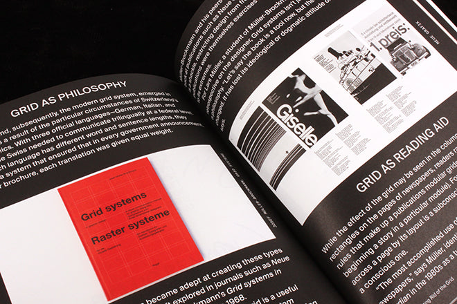
‘Invisible’ is used in all senses as a starting point for the content: we meet a series of hidden helpers behind great designers that highlight the often overlooked collaborative side to design; Ruth Sykes reminds us of the invisible women of graphics history; there’s an enjoyable overview of the hidden structure of the grid by Luc Benyon; a brief discussion of the work of artist Alexandra Bell reminds us of the invisible editorial structures that dictate the make up of the front page of The New York Times.
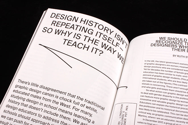
It’s a rich mix of material that’s bound together by a strict design structure from Maziyar Pahlevan. This blends the stories together in a manner that defies traditional practice yet works. The design and format work in parallel to make Eye on Design a beautifully flickable piece of publishing, while the simplicity of the typeface, use of scale, and editorial directness (‘Design history isn’t repeating itself – so why is the way we teach it?’ is a typically effective headline).

But the most striking thing about this first issue is the way it feels like it has been written and made by designers. The editorial conversation swings effortlessly from print to coding to art, addressing the personal and the political as well as both the detailed and the general. It assumes a high level of interest in all aspects of visual culture and approaches its subjects with respect even when jumping briefly into them.
Founder: Perrin Drumm
Managing editor: Liz Stinson
Editors: Emily Gosling, Meg Miller
Associate editor: Madeleine Morley
![]()
Perrin Drumm will be speaking about Eye on Design at our forthcoming ModMag NY Edition. Details here.