Interview’s Salad Pages
One of the many highlights of the relaunched Interview magazine is the Salad Pages section.
Essentially a service department — a mix of small stories offering product info for readers while honouring commitments to advertisers — the design of the four pages enables Interview to transcend what that implies. This has been the case in all three issues to date, but now, in celebration of its 50th year, the 524th edition of the magazine has substantially increased its page size to more-or-less match its original 60’s scale.
‘It’s what we intended from the start to be honest,’ editorial director Richard Turley told me, ‘but we inherited that smaller glossier size which it transpired we couldn’t change till now. It’ll remain this size all year and probably beyond.’ The image above shows the last issue on top of the new one. It’s nearly doubled in size.
That new size is a tall 265 x 420mm, and the paper is a satisfyingly thin, less glossy stock that flicks well and sounds great as you do so. This is one noisy mag!
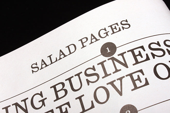
But the main thing is the larger scale, allowing the Salad Pages section (above) to make an even stronger visual statement tha before. Like a more commercial version of Turley’s Civilization newspaper project (a previous Salad Pages was overwelmed by the repeated demand to BUY! BUY! BUY!), they work brilliantly, the design squeezing the most out of a single typeface (Caslon Ionic No. 2) used in black and white.
In this respect it matches the rest of the mag, with the busy-ness of the design setting it apart. ‘I think of the Salad as a magazine within the magazine, it is essentially produced as it’s own tiny little publication,’ section editor Lucas Mascatello explained, ‘The content is baby-sized but made by adults.’
Lists, infographics and mini interviews run riot across the page. A reference to a Celine briefcase (above) is cause for a random list of things to put in the leather case (‘Someone else’s iPhone charger, Poppers…). ‘The idea was to surround the favours with side eye ‘talk of the town’ content,’ says Turley, ’but its really metastasized into something quite different.’
There’s no grid to hold the pages together – stories are defined by different type sizes and seperated by horizontal, vertical and diagonal rules as needed. Sentence ends even run off the page at points (above, below), exaggerating the scale further. This section is f-u-n.
Like so much Richard Turley has been involved in (Bloomberg Businessweek, Mushpit, Good Trouble…), the Salad Pages section is design for the moment. It is hard to think of a regular section of another current magazine that uses so few elements to create something so alive and vital, yet efficient. The design is built from the content, the two in perfect unison making the ideal contemporary reinterpretation of Warhol’s original Interview.
Editor-in-chief: Nick Haramis
Creative director: Mel Ottenberg
Editorial director: Richard Turley
Art director: Kurt Woerpel


