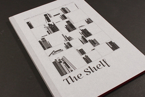
Magazine of the Week: Shelf Journal #2

The launch issue of The Shelf Journal created lots of interest when I featured it here last summer, so it’s exciting to now feature the brand new second issue.

Like that first issue, this new one does the subject of publishing design (‘the cult of the shelf’) proud, being a great example of design itself, both in terms of production and layout. Slightly taller than A4, the 124 pages are perfect bound with a rough grey card cover (above) giving an immediate tactile presence. The pages edges are printed red (below). It’s a very attractive package.


Inside, the design manages the impressive double act of being intelligently clear and consistent while also being completely odd; the detailing is unique, with text columns and images alike being decorated with shelf icons and book-end effects. If that sounds like it should’t work all I can do is agree – it sounds like it would be a highly irritating quirk yet the pages look great. The design is very self-aware and functional but also full of character. This is at least partly due to all the text and decoration being black and white, with only the many examples of book (and occasional magazine) designs using colour (below). It also successfully publishes all content in French and English languages alongside each other.


Although mainly book-orientated (including design hero Derek Birdsall telling his life story via his favourite design books, above), there are several magazine-based stories: designer Sébastien Hayez discusses four examples from his collection of first issues (Arts et Metiers, Graphis, Portfolio and Neue Grafik) and there’s an interview with Mirko Borsche (Ziet Magazin, Super Paper). There’s also a fascinating set of written letters exchanged during the 1930s between typographers Maximilien Voz (France) and Stanley Morrison (England). The two discuss the national differences in approach to type. Sadly I don’t think we’ll see contemporary emails recorded for posterity in the same way.

The Shelf Journal is a very special magazine, a firm favourite, and I’m pleased to have copies for sale in our shop.


