Magazine of the week: Wrap

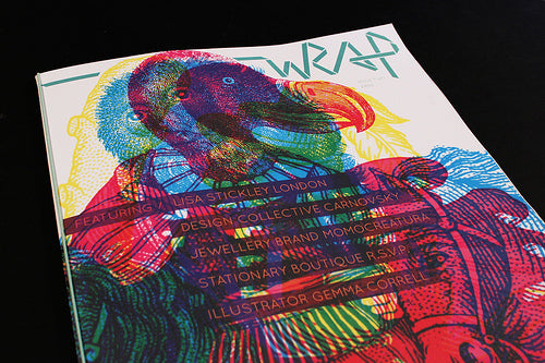
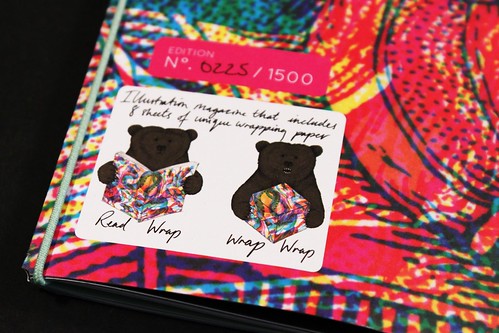
Wrap is a new magazine that once read can be used to wrap gifts. If last Autumn’s first issue was a little too much like wrapping paper – it was really just a pack of giftwrap with articles on the back side of the sheets – issue two has tilted the balance back in favour of editorial.

The set of A2 printed papers is now loosely bound by an elastic band, meaning there is a structure to the issue, and all the work is based around the theme ‘animals and creatures’.

This means the beautifully printed pieces of illustration (the wrapping papers) crash together in happy contrast (above) but can be pulled loose to be used as giftwrap or even as poster (work above by Patrick Hruby and Dan Funderburgh)

The backs of the sheets carry interviews with the illustrators…

…while the cover illustrator (Carnovsky) gets a centrespread with a cut-down page interview.

The cover is a heavier card stock, the back part of which is perforated into postcard-sized reproductions of the eight A2 pieces (below; work above by Zoran Pungercar and Elly Stringer).

Sometimes such experimental pieces can appear a gimmick rather than something of substance, but with issue two I think Christopher Harrison and Polly Glass, the two people behind Wrap, have got the balance right. This is a lovely piece of magazine-making that also provides a secondary use for its pages.
If you can bear to pull it apart rather than keep the issue intact, that is.


