Paul Willoughby, creative director, Weapons of Reason
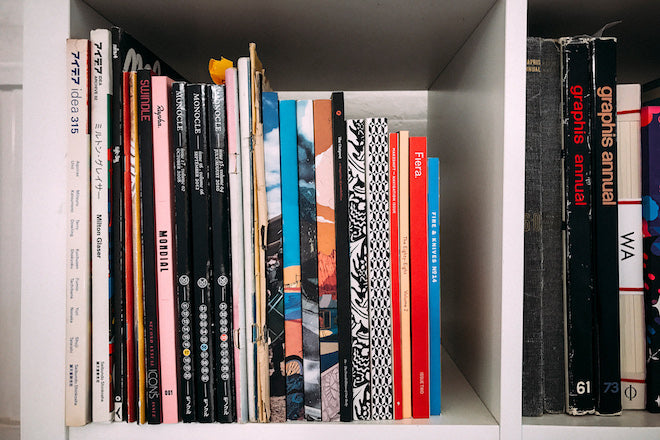
This morning we’re at design agency Human After All, browsing through the mag shelves of creative director Paul Willoughby. Formerly creative director of Little White Lies magazine, Willoughby’s staple illustrative style is now most vividly seen across the pages of Weapons of Reason. We catch up with him after the release of WoR four, the power themed issue.

As ever, we asked Paul to select three titles that have been important to the development of his visual sensibility: an old issue, a new issue and another thing...

An old issue: Pooka, 2004
I have a soft spot for mags in languages that I can’t read. Mags can transcend language to be something more visceral and object based. This is a beautiful example of a Japanese children's book magazine (a magazine about children's books) doing just that.


I love the naivety and playfulness; it's all about the joy of creating. The simplicity of some of the illustrations was a big influence on Weapons of Reason's visual language.

A new issue: Real Review no2, 2017
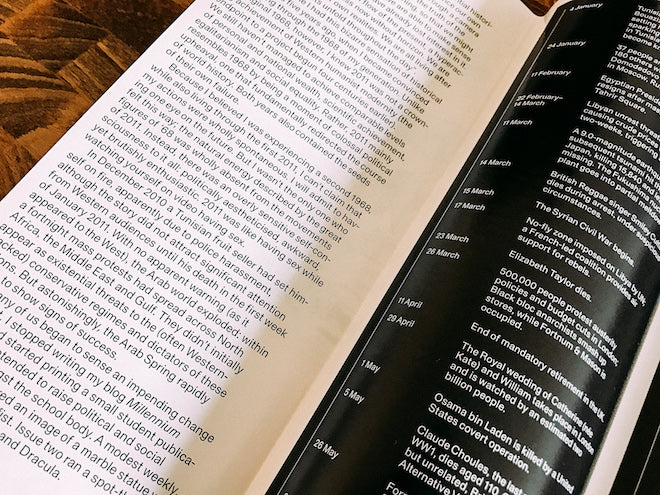
Here’s one that breaks the mould. It doesn’t even fit on a shelf properly – they have to find a place for it to perch in the mag shop. The Real Review was recommended to me by another magazine enthusiast called Jeremy Leslie. I picked up a copy and wasn’t disappointed.

I’ve become a bit quote junkie lately, collecting reams of the things from mags/books and the internet. The Real Review gives a tantalising taste of what's inside by picking out some inspiring quotes on the outside of its folds.

Some might call it’s overtly minimalist design bland, but I welcome the lack of visual noise or graphic finery. The plainness creates a seamless link to your mind hoovering up the stories – I found myself sucked into the life of an Uber driver, living the dream, part of the giant Uber organism.

And another thing: Reading True Story (via Google Translate app!)
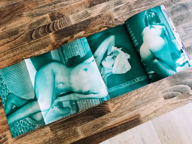
My Google translation app revealed one of the cover lines as 'bad wisdom of sexual life'. That's not exactly what I was looking for when I plucked this gentleman's magazine from the dusty shelves of and old Jimbocho bookstore when on a trip to Tokyo 2005.


But I did love the pure aesthetic of the piece – the range of papers, foldouts and monotoned images, interspersed with amusing little manga stories. It was a big inspiration for design elements in Little White Lies.


