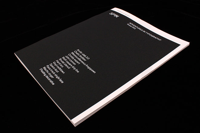
Spin: Adventures in Typography #1
This new magazine from design publisher Unit Editions arrives with huge expectation for anyone who follows them and sister company, design studio Spin. Together they have developed a strong reputation for the quality of every elements of their books: the subjects, editing, design and production are always exemplary. What could a magazine produced by the same team be?
Now we know. Spin: Adventures in Typography immediately matches the production expectations, coming in a screenprinted transparent plastic envelope that is anything but throwaway. The magazine inside has a cut down textured cloth cover, available in three colours (white, silver or black) and the 52 pages of pristine Fedrigoni paper inside is printed in a single special black. It looks and feels great, and for Spin obsessives, the page size matches that of their recent ‘Spin 360’ monograph.
But it’s the content of those 52 pages that make this our Magazine of the Week. Spin: Adventures in Typography is the perfect name for the starkly simple series of designs that run one per page. Led by Spin founder Tony Brook, the design team have managed to express the joy of typographic experiment with a freedom and lack of restriction not often associated with the studio. Theirs is usually a very measured and controlled aesthetic; in this magazine we get a glimpse of the play and passion for typographic design that underlies that control.
There are many magazines dedicated to displaying illustration and photography in their barest terms, but it is truly refreshing to come across one that does the same for type. These pages are abstractions, occasionally related to Spin projects (there’s a pair of designs that hint at their upcoming Paula Scher monograph – each design here has a brief title and these are labelled ‘Paula Extra Bold’) but are otherwise pure experimentation. the striking black and white abstractions regularly tumble over the edge of legibility, using photographs of crumpled materials and spraypaint as often as software as their basis.
Sometimes the pages seem to offer insight into an imaginary work-in-progress, with repeat versions of similar shapes seemingly developing to become something more definite; other pages carry single, bold characters from an invented alphabet. Every piece is well worked – they don’t feel like random one-offs but highly developed designs for fantastical projects. I found myself wondering: what were these logos for? What do the patterns represent? What is at first simple becomes increasingly complex the more you look (animated versions on the Unit Instagram feed are worth checking too).
Spin: Adventures in Typography is a fascinating project that will be excite anyone with a visual sense regardless of their knowledge or interest in type and typography. It is a truly liberating piece of publishing — I can’t think of another current magazine doing anything quite like it.
Design: Tony Brook, Rachel Dalton, Cluadia Klat, Jonathan Nielsen and Callin Mackintosh


