

The New York Times Magazine, redesigned


Sometimes a magazine story comes along that really engages magCulture readers, and news that the New York Times Magazine was relaunching under new editor Jake Silverstein, with Gail Bichler promoted to creative director and Matt Willey imported as art director certainly did that. An 119-year old magazine most would rate as one of world’s great examples of editorial design was investing in being better? This weekend US readers will see the first edition of the new magazine; meanwhile, here’s a preview courtesy of Bichler, who talks us through the pages.


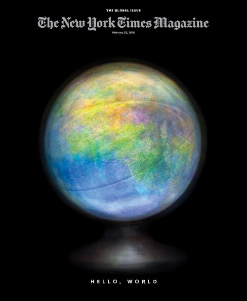
The relaunch is announced by four front covers, backing up Bichler’s view of the print front cover as social media event, expressed in our recent At Work With interview (and indeed if you’ve been following your twitter feed this past 24 hours you’ll probably have seen these covers already). ‘The first edition is subtitled ‘The Global Issue’ and we asked four artists to make images reflecting that theme using the globe,’ she explains (top: Matthew Pillsbury and Hannah Whitaker; above: Toilet Paper’s Maurizio Cattelan & Pierpaolo Ferrari and Sara Cwynar).

Index
‘Our new index is stripped down and chartlike. The format gives its own column and more prominence to our digital features. The redesign is multi platform, so our digital presence will also reflect the new look of our print publication.’


First Words
‘The opening essay will feature a rotating group of columnists writing about language. The text-only design of the opening page introduces the magazine each week with a statement of values: we stand for quality writing, and incisive, provocative commentary.’

Search Results
‘This page is an annotated guide to things of interest on the Internet. Jenna Wortham, one of our staff writers, will be diving into online culture to report on the trends, styles, new forms of expression and content-making that are being generated there.’

On Photography
‘Essayist, novelist and photographer Teju Cole will consider the many ways that photographs and videos are used to convey meaning in modern life. We have removed the traditional head and subhead here, leading instead with a short, inviting sentence. This page will rotate with essays on money, clothing and nature, and all of the columns will include digital-only content on our web site.’

Letter of Recommendation
‘We’re asking a different writer each week to simply recommend something. It could be anything — an album, a frying pan, a hotel, a pencil, a type of food, a wine, a scene from a movie, etc. The point is for writers to convey the depths of their passion for this thing and convince a reader that it is worth sampling.’

The Ethicists
‘This is a reinvention of one of our most popular pages; a column in which reader questions about ethical behavior are answered. We’ve reimagined it as a weekly half-hour podcast in which a panel of three ethicists discuss these questions. The print and online column will be an edited version of this podcast.’

Lives
‘For many years, Lives anchored the back page of the magazine and took the form of a short, written memoir. With the relaunch, we’ve moved it off the back page and shifted it from a primarily written page to an as-told-to page. It will be more international in flavor, and cover a much wider array of characters and experiences.’
That gives a good idea of the basic structure of the magazine’s pages; it’s a development rather than a radical reinvention. ‘The magazine has always been strong,’ says Bichler, ‘so there was no reason to completely dismantle it. Our aim was to respond to the vision of new editor Jake Silverstein, and to our new content. We also wanted to better distinguish ourselves as a subbrand of The Times across all platforms while remaining true to the magazine’s visual legacy.’

That legacy remains present in the pages through a range of new fonts by London-based designer Henrik Kubel, a longtime collaborator of Matt Willey’s. A new headline typeface is based on Stymie, the condensed slab serif that has been a signature part of the magazine since the seventies. It features on most of the pages above, as well as on this example feature opener (above).
‘Henrik also created a sans serif, a serif, a hairline version of the serif and a text font, which are completely bespoke and unique to us,’ explains Bichler, ‘He created 29 styles and weights, only some of which are seen in our first issue. Our team is looking forward to experimenting with them and figuring out our typographic language more as we move forward.’

The magazine logo was redrawn by Matthew Carter too, giving it a more spacious, open and digitally friendly look.

At a time when many major publishers remain resolutely focused on cutting costs, it’s refreshing to see one invest in quality. As well as rebuilding the creative team, the publishers have invested in the physical production of the magazine. While this launch edition will boast a hefty 218 pages, the weekly issue will have at least 15% more pages than before. ‘The new paper is heavier and brighter which will mean a significant improvement in the quality of our reproduction,’ says Bichler. The additional pages will be spread across the opening sections, an extra feature and extending stories, particularly photography.

First impressions are this is a really smart redesign, building on the success of the previous iteration but developing it further: improved paper, more distinctive typography and a conviction in the print version as a thing in its own right alongside a strong digital presence.
Finally, Bichler’s at pain to emphasise the collaborative nature of the redesign. ‘Matt Willey and I worked closely with Anton Ioukhnovets to create the look and feel of the pages, and our art and photo teams created the pages seen here.’
Interview by Jeremy Leslie
Read editor Jake Silverstein’s introduction, on their new website.
See a slideshow of the creative team at work.
Read our At Work With interview with Gail Bichler