Nicholas Blechman, The New Yorker
Nicholas Blechman was art director of The New York Times Book Review and The New York Times op-ed page before joining The New Yorker as creative director in 2015. A busy man, he also edits, designs and publishes political underground magazine Nozone, creates illustrations for GQ, Travel + Leisure, Wired, and The New York Times and co-authors ‘One Hundred Percent,’ a series of limited-edition illustrated books with Christoph Niemann.
How was your weekend?
This Friday my son had two friends over for a sleepover, which led to pillow fights, pancakes, and general confusion. To add to the stress, I was finishing up a new book: a self published collaboration with Christoph Niemann entitled ‘Conversations’. We uploaded files to the printer Sunday, only a couple of hours before the deadline.
Tell us about your typical Monday journey to work
Monday morning, I caught the 3 train to Chambers Street. Whenever I ride the subway, I look around to see how many people are reading The New Yorker. I spotted two, while another had The New Yorker tote bag. I grabbed a coffee at Joe’s in the underground complex that connects the Calatrava train station to One World Trade Center, and arrived at work a few minutes before 10 a.m.
Describe the state of your desk and office
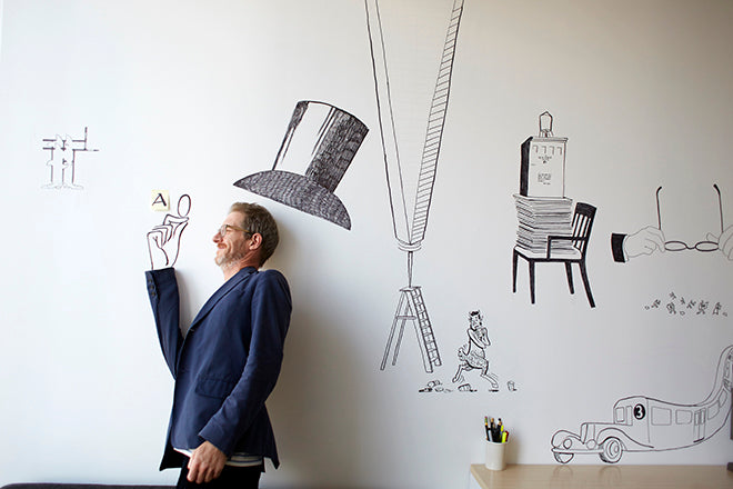
I work on the 38th floor of One World Trade Center. The North side is all glass with stunning views of Manhattan. The East side of my wall is covered in drawings by Christoph Niemann. Whenever Christoph visits from Berlin, we pull out some sharpies and draw on the wall (top). The drawings all relate to The New Yorker. For example, there is a drawing of a chair from the old offices on 43rd street, next to the hair of John Updike, and a Satyr from a Lee Lorenz cartoon. Its nonsense to the outside world, but for us, it’s a secret hieroglyphic language.

Which magazine do you first remember?
The purely visual, no words issue of Colors, art directed by Fernando Gutiérrez and edited by Tibor Kalman. It’s a provocative, political tour de force, that redefined magazines.

I devour anything designed by Matt Willey and Gail Bichler. I also admire Leo Jung’s The California Sunday Magazine. German magazines Die Zeit Magazin, Suddeutsche Zeitung Magazin and Weltkunst are always on my desk.

Weekly magazines have very tight schedules; yet I can’t imagine The New Yorker office hitting a frenzied state as the final deadline looms.
The magazine closes different sections throughout the week, so we’re always on deadline. By Friday, most of the magazine has shipped. It’s a finely tuned machine. The last issue we closed was a special double issue, with a 360 VR cover by Christoph Niemann (above).
The magazine has a strict, newspaper-like design. Does every page go through the design department or is much of it put on page by editors?
The New Yorker is not a magazine that needs to regularly rethought or redesigned. Yet small elements change gradually. Is there a master plan, a working list, that you're ticking off one by one?
The New Yorker is a magazine shaped by time. Very little has changed since the first issue in 1925, and that respect for legacy is part of our visual identity. Since I arrived in 2015, we’ve been fine tuning an incredibly resilient and elegant design. Our road map for design changes in the print magazine is mostly complete. I think the table of contents could be tweaked, and the design of the Fiction page could also be tinkered with. Most of the big innovations you will be seeing at The New Yorker will be online, as we contemplate a web redesign and introduce improvements to The New Yorker Today app.
 Pick a spread from the current issue of New Yorker and tell us what it says about the magazine.
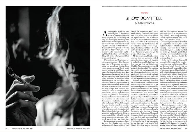
This spread (above) is from the Special Fiction Issue, out this week. We doubled the wavy rule on top and treated the rubric in red, otherwise it is a classic New Yorker spread: text heavy, yet elegant.

Last month we introduced a number of design changes at The New Yorker. Christoph Niemann redrew the Talk Of The Town illustration to include our own offices in the skyline (above). The Shouts & Murmurs column now has its own illustrator, Luci Gutiérrez (below). The body text, set in Caslon, now uses customized non-lining numerals.

What are you finding most frustrating about your work this week?
Keeping up with the news cycle is always a challenge. The endless stream of leaks and scandals from the Trump White House wreaks havoc with our schedule. I find it especially difficult to create compelling, original illustration online with little lead time. This week we have the Comey hearings in Congress. Can we do something interesting with this?
What's going to be the highlight of this week for you?
The art department is going on a trip to Kings Distillery, a small batch whiskey maker in Brooklyn. Our former pre-press and photoshop wizard is head of production at the distillery. Can’t wait.
What will you be doing after this chat?
Grabbing another cup of coffee and talking with my staff. I’ll chat with design director Aviva Michaelov about upcoming feature stories; director of photography Joanna Milter about last night's NBA game; and consumer marketing design director Nico Schweizer about typography and how to rig a laser sailboat. Then I’ll chase down David Remnick, editor of The New Yorker, to get his eye on the issue we're closing this week.


